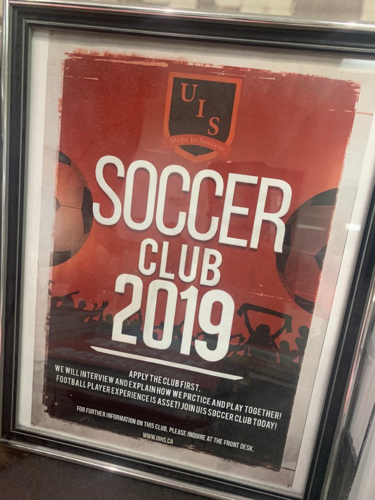
This one is contrast because as I see this poster I get it is a soccer club ,at first I see those really big letters.secondly,I see the explanation about this club at the bottom.

I think it is repetition and proximity. It is repetition because there are a lot of cola .it’s repeat. And for the proximity, there are all the soft drink and closed together.
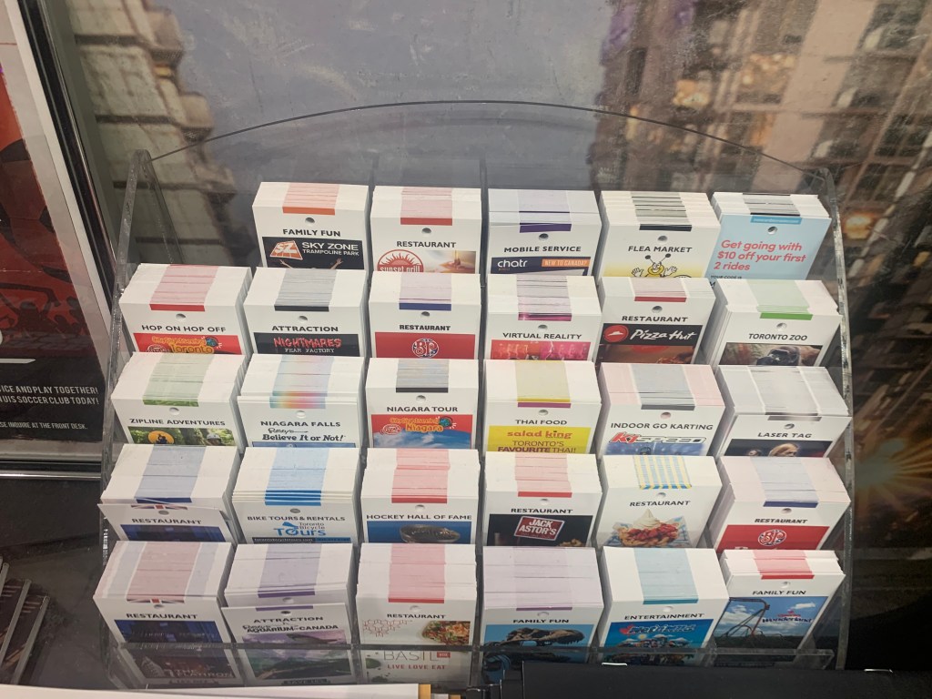
In my opinion, it is proximity because it is all the information about Toronto. And those card related together.and I believe that it has alignment if you ignore the first row, it shows alignment. Each row and group are straight.

I think it is left alignment and contrast. for this page ,there are a lot of blue contrast and thick letter make readers can see it easily